Web Design
Improov
Two creative directions for a landing page and newsletter aimed at a new audience.
- Role
- Web Designer
- Studio
- Orfé Branding Studio
- Year
- 2023
- Tools
- Adobe XD

The challenge
Improov, an online platform that teaches Microsoft software, wanted to reach a new audience: women in their mid-twenties. I was asked to design two distinct directions for a landing page and email newsletter: one friendly and focused on personal growth, the other more serious and focused on academic mastery.
The approach
Research
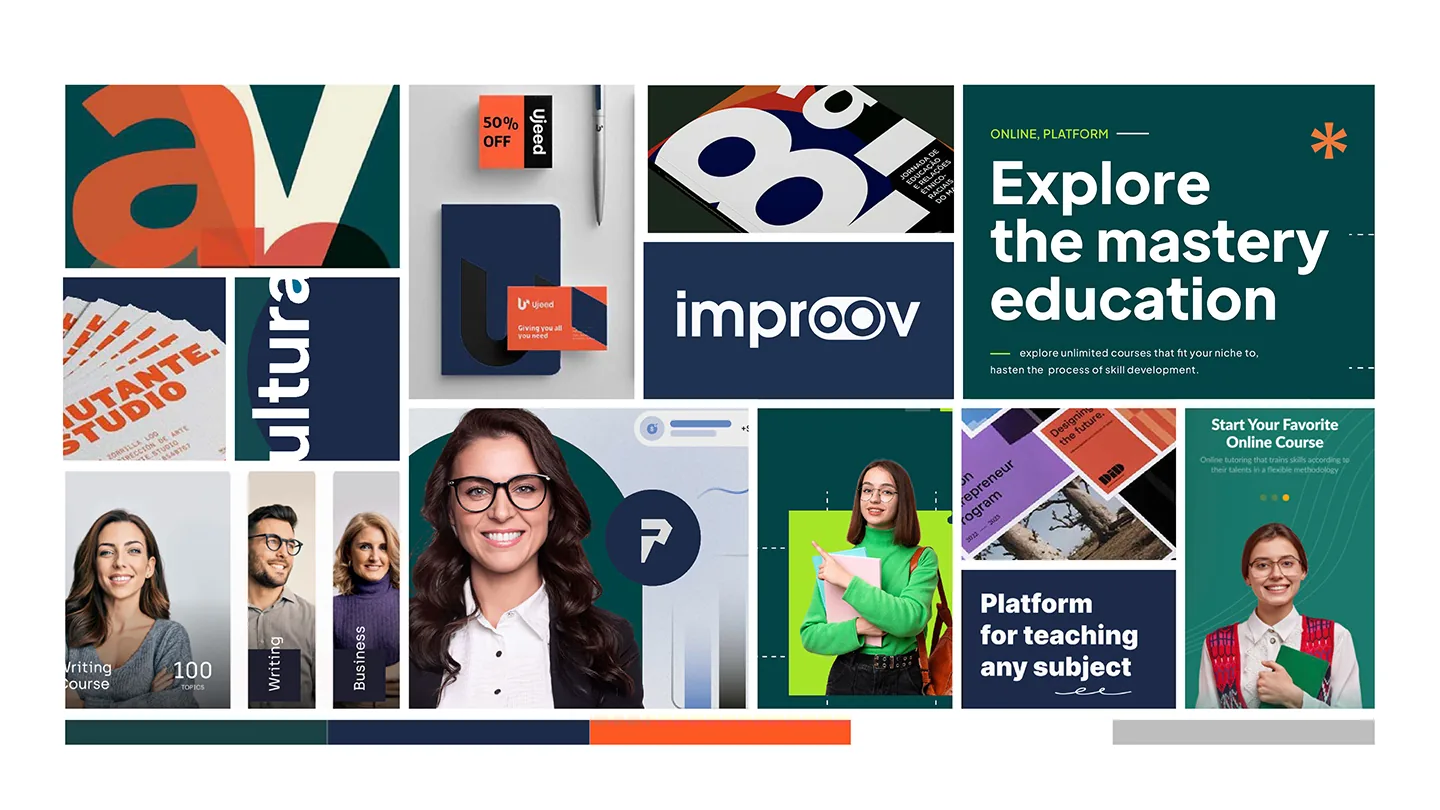
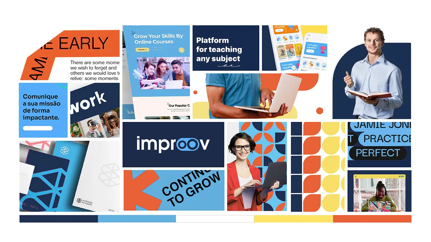
After researching competitors and trends in similar fields, I built a moodboard for each direction, then created a shared wireframe for the landing page and newsletters before applying each style’s colours and type.
Personal growth
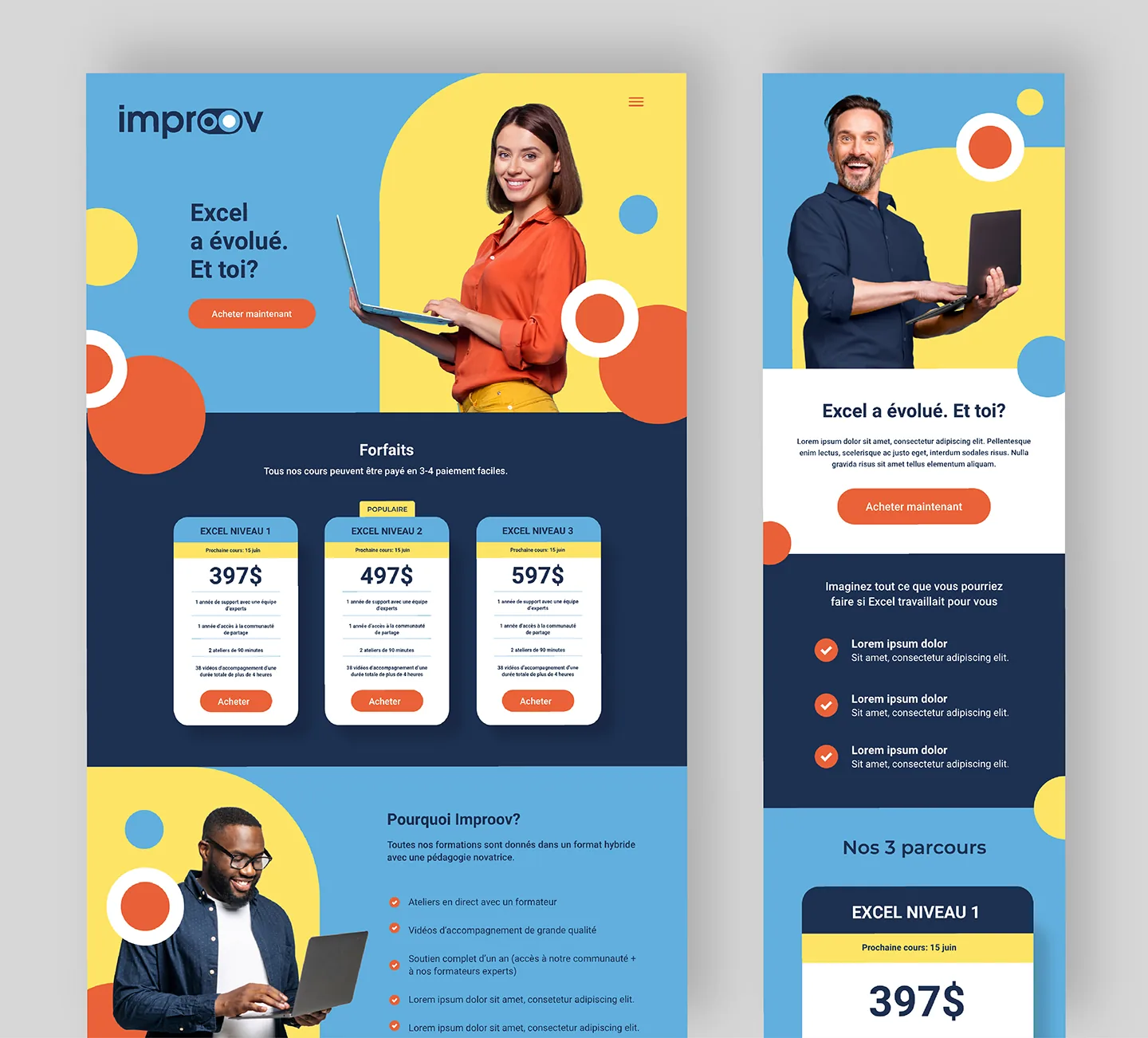
Bright colours and playful shapes are popular with this audience. I reused the circles-within-circles from Improov’s logo as the main graphic device and kept the brand typeface, so the new look still felt connected to the brand.
Academic mastery
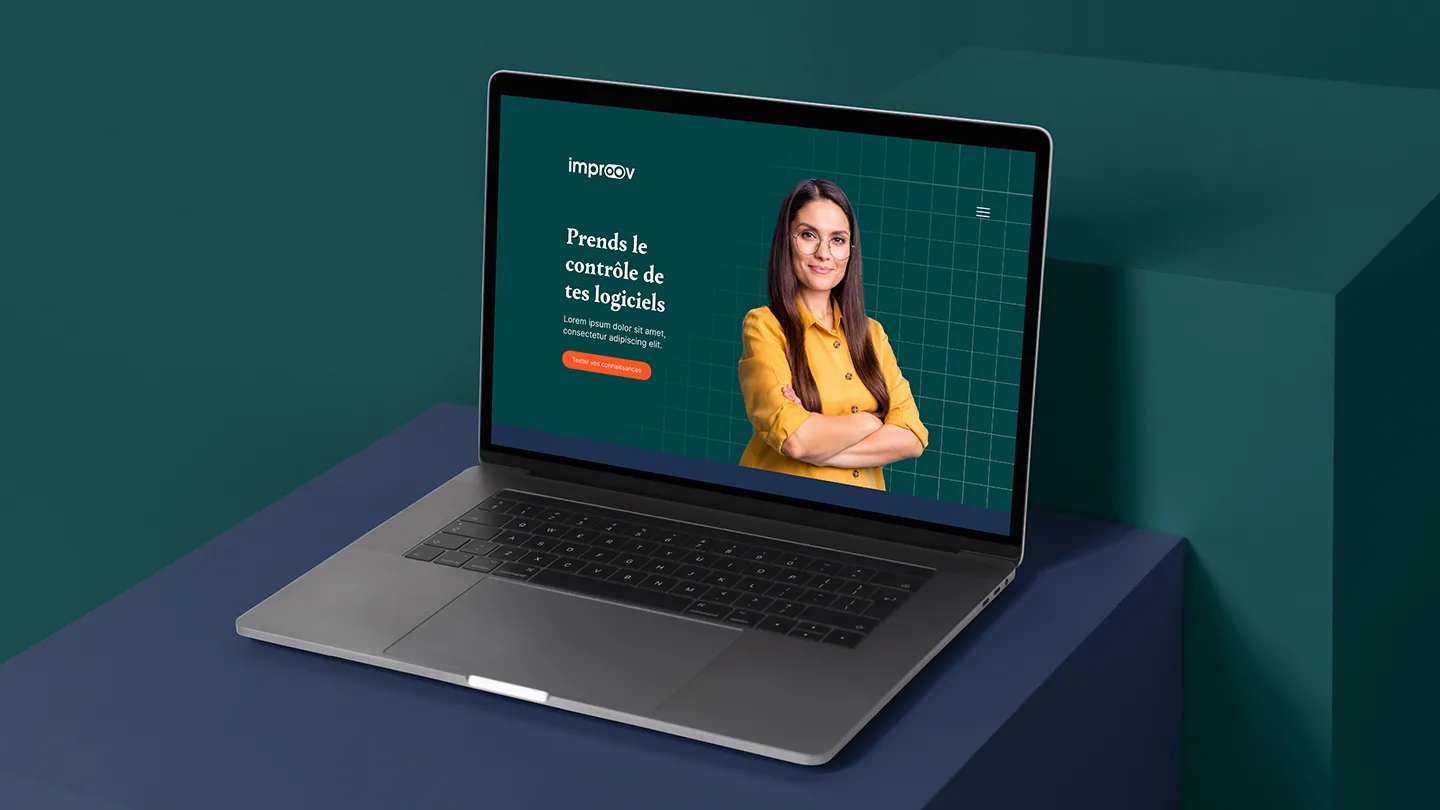
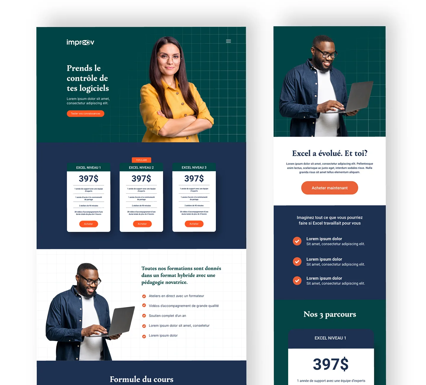
Sober colours, a square grid that evokes textbooks and graph paper, and serif headlines give this direction a scholarly feel.
Working within the CMS
The CMS only supported simple content blocks, which made the floating shapes of the personal-growth design hard to build. I baked those elements into the static images, so they still appear to float outside the frame without causing code or responsiveness issues.
The outcome
Both directions were delivered as ready-to-build designs for the landing page and newsletter, giving Improov a clear choice between two approaches for reaching its new audience.
Direction 1: Personal Growth, moodboard and designs
Direction 2: Academic Mastery, moodboard and designs