
Miel à Ben
Software
Adobe Illustrator
Adobe Photoshop
Role
Designer & Illustrator
Company
Orfé Design • 2022
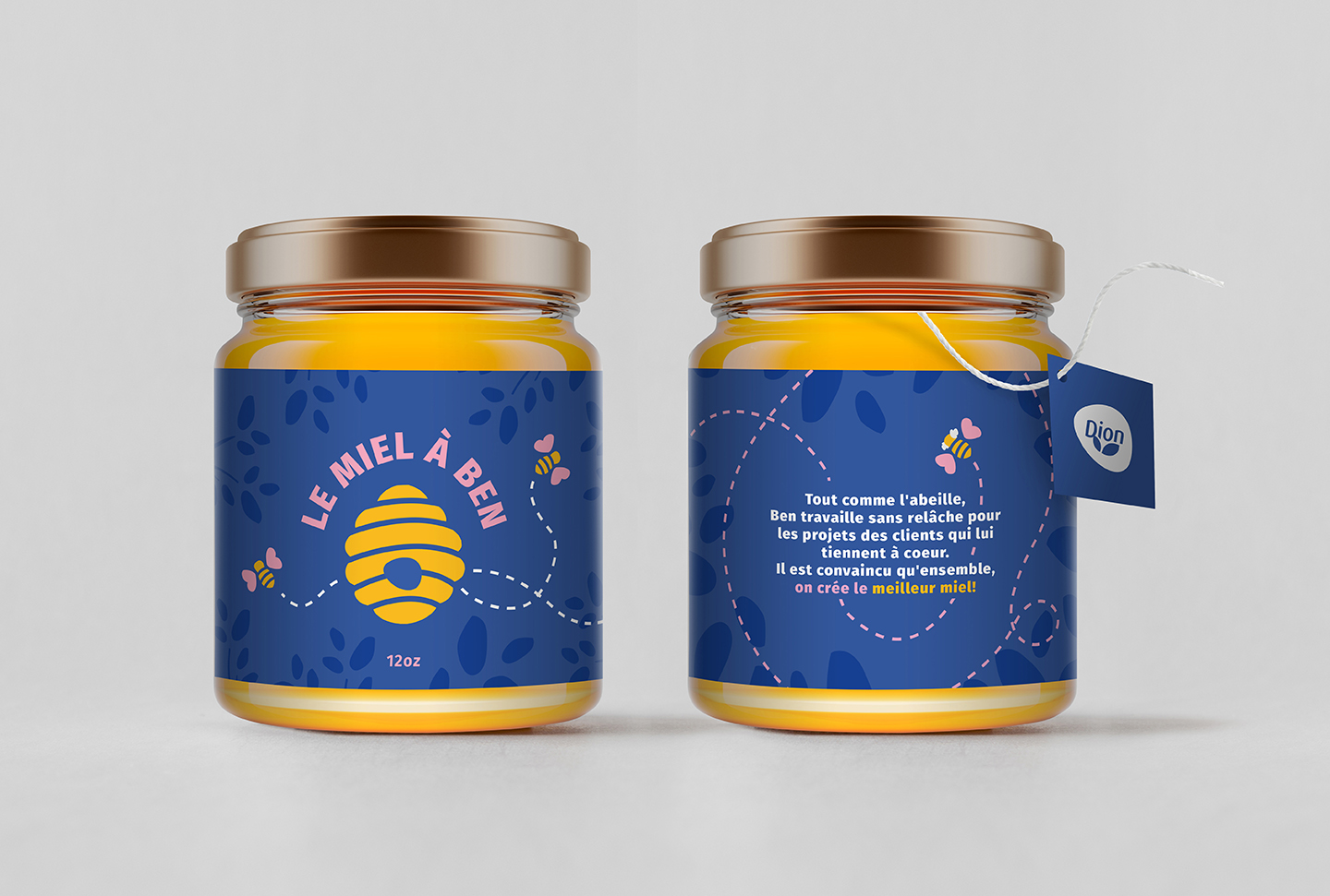
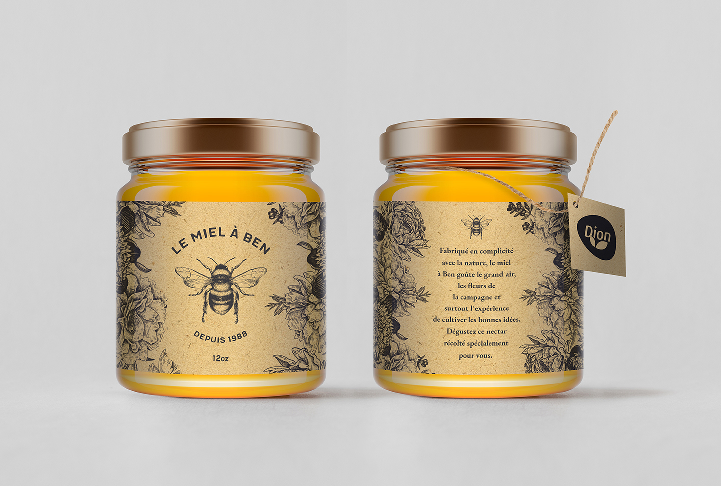
I was asked to design and illustrate a honey jar label for Épices Dion. The honey, harvested and packaged in Quebec by one of their partners, Ben Lachance, was part of a Christmas gift to the Épices Dion employees. I was asked to create three different styles of moodboards for the client to choose from.
Planning: I began by researching honey labels as well as artisanal product designs. After gathering dozens of screenshots of different styles of products, I concluded that there were three main visual directions this label could take: artisanal and natural, playful and modern, or classy and high-end. I then built three distinct moodboards for each style, from which the client chose two.
Design: For the playful and modern design, the illustration itself was fun and easy to do, requiring loosely drawn lines and shapes to emulate the carefree and playful feeling reflected by the moodboard. I found a bold and chunky font that would match the fun and slightly chaotic feel of the illustration, and matched it with a bright and eye-catching colour palette. For the artisanal version, I used vintage illustrations to convey a classic, handdrawn feel, adjusting the illustrations where necessary using masks and modifying strokes using the pen tool. I added a kraft paper texture to the background to simulate the paper so often associated with artisanal products.
Challenge: The main challenge of this project was to find a way to include the Dion logo in the artwork in a way that wouldn't ruin the artisanal feel of the honey; adding the logo directly to the label made it feel impersonal and corporate.
Solution: After experimenting with different placements for the logo, I realized I could completely bypass the label and instead put the logo on an external hangtag that could be easily removed. Not only would this preserve the original design of the honey label, but it would also allow space for a personal message from Dion to their employees. Once approved, I explored different kinds of strings and tags that could accommodate each version, using Photoshop to create a realistic mockup of the design.