Illustration
Miel à Ben
Two honey-jar labels for a holiday gift from Épices Dion to its employees.
- Client
- Épices Dion
- Role
- Designer & Illustrator
- Studio
- Orfé Branding Studio
- Year
- 2022
- Tools
- Adobe Illustrator
Adobe Photoshop
The challenge
The honey was harvested and packaged in Quebec by Ben Lachance, one of Épices Dion’s partners, and given to Dion employees for Christmas. The label needed to feel artisanal and personal while still crediting Dion, but adding the corporate logo directly to the label made it feel impersonal.
The approach
Research & moodboards
After studying honey labels and artisanal packaging, I identified three possible directions (artisanal and natural, playful and modern, or classic and high-end) and built a moodboard for each. The client chose two.
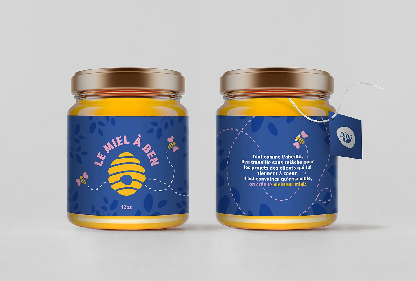
Playful version
Loose, hand-drawn lines and shapes give the illustration a carefree feel, paired with a bold, chunky typeface and a bright, eye-catching palette.
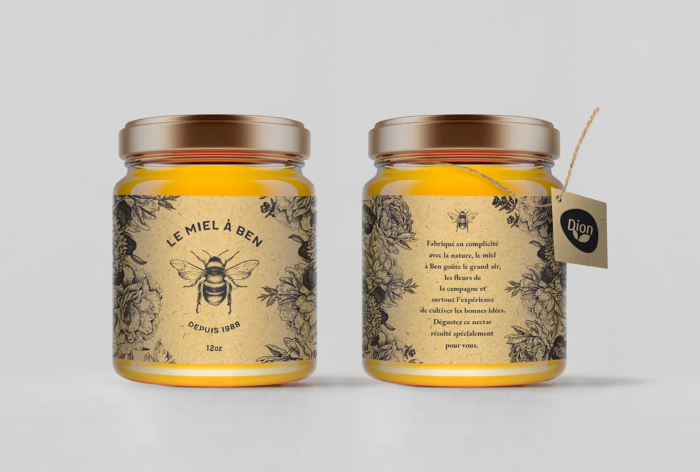
Artisanal version
I adapted vintage engravings with masks and the pen tool for a classic, hand-drawn look, and added a kraft-paper texture to evoke traditional artisanal packaging.
The solution
Instead of forcing the logo onto the label, I moved it to a removable hangtag. This preserved the label design and made room for a personal message from Dion to its employees. I then explored strings and tags for each version and produced realistic mockups in Photoshop.
The outcome
The hangtag solution was approved, giving employees a gift that felt handmade and personal while still clearly coming from Dion.